5 Common Charity Website Problems (and How to Fix Them)
- Nov 1, 2024
- 4 min read
Updated: Nov 5, 2024

Is your charity website more like a dusty filing cabinet than a powerful tool for fundraising? You’re not alone! Many non-profits struggle with website issues that make it hard to connect with supporters and share their mission effectively.
But don't worry – I'm here to help! Here are five common charity website problems and, most importantly, how to fix them.
Problem 1: Outdated Website Design
Symptoms:
Does your website look like it’s stuck in the early 2000s? Was your website created by a friend of a friend as a favour? Maybe it was never really finished, or you feel embarrassed to show it off. If you’re hesitant to direct people to your website, it’s a sign that the design might be holding you back. Flashy banners, clunky navigation, and painfully slow load times don’t just look dated; they can drive potential donors away.

Fix:
Invest in a fresh, modern website design that reflects the energy and mission of your charity. Take a look at Black Girls Do Run UK for inspiration. Their website is a fantastic example of a clean, vibrant design that feels welcoming and inspiring. It uses simple navigation, clear calls to action, and strong, dynamic visuals that reflect the organisation's values and community.
A refreshed design doesn’t just look great – it helps build credibility and trust. A well-designed website encourages visitors to stick around, explore, and support your work. If it’s time for a refresh, a polished and contemporary look will make sharing your website something to be proud of, not something to avoid.
Problem 2: Confusing Navigation
Symptoms:
Visitors struggle to find important pages, like “Donate” or “Contact Us.” If navigating your website feels like a maze, visitors might leave before they engage.
Fix:
Simplify your website’s navigation. Create intuitive menus with concise labels and ensure key pages are easy to access. An organised, user-friendly layout keeps visitors focused on what matters most – supporting your mission.
Problem 3: Lack of Compelling Content
Symptoms:
If your website reads like a dry report, it’s missing an opportunity to connect emotionally with visitors. Without powerful storytelling, compelling images, or testimonials, it’s hard to convey the impact of your charity’s work. Visitors might come and go without feeling the motivation to get involved or support your mission.

Fix:
Bring your charity’s story to life with engaging, heartfelt content. A wonderful example is Abbie's Army. Their website uses moving stories, striking visuals, and clear, impactful language to create an emotional connection with visitors. Through real stories and testimonials, they make the mission personal, helping people understand the profound impact they can have by supporting the charity.
Sharing your charity’s journey in this way makes a big difference. Use images, video, or even short stories to illustrate the work you do and the lives you touch. Showcasing the real-world impact of donations and volunteer work helps potential supporters see the value of getting involved. And remember, it’s not just about numbers; it’s about the people and communities you’re helping. A story told with heart is a story people remember – and want to support.
Problem 4: Missing Calls to Action (CTAs)
Symptoms:
After exploring your website, visitors may be left wondering, “What now?” Without clear calls to action (CTAs), they may not know how to support your charity – whether that’s through donations, volunteering, or staying updated. Every visit is a chance to inspire action, but without visible CTAs, you risk losing valuable support.

Fix:
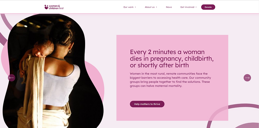
Make it easy for visitors to know exactly how they can get involved. A great example is the Women & Children First website. Their CTAs are clearly visible throughout the site, guiding visitors to take meaningful actions, like “Donate Now,” “Get Involved,” and “Subscribe for Updates.” These buttons are strategically placed, bold, and easy to find, encouraging people to engage without feeling pressured.
Using strong, direct language like “Join Us,” “Support Our Work,” or “Make a Difference Today”, or in their case "Help mothers to thrive" can prompt visitors to take action. Place these CTAs consistently across key pages, such as the homepage, donation page, and impact stories. Effective CTAs can significantly improve engagement and conversions, turning passive visitors into active supporters. Think of them as gentle nudges, helping people take the next step toward making a real impact.
Problem 5: Lack of Mobile Responsiveness
Symptoms:
Your website might look great on a desktop, but on a phone or tablet, it’s a disaster. Buttons and text may be hard to read or click, images don’t scale properly, and pages can feel cluttered or disorganised. With so many people browsing on their phones, a lack of mobile responsiveness can prevent potential supporters from fully engaging.
Fix:
Make sure your website is designed to adapt seamlessly across devices. A great example is Hackney Children & Baby Bank. No matter the device, the design remains clear, beautiful, and easy to navigate. Every element, from the images to the buttons, scales perfectly to fit different screen sizes, giving visitors an equally engaging experience on mobile, tablet, and desktop. Ensuring your site is mobile-friendly not only improves accessibility but keeps potential donors and supporters engaged wherever they are.
Most website builders and platforms now offer mobile-responsive design templates, making it easier to achieve this high-quality experience for all users.
Bonus Tip: Keep Your Website Fresh
Regularly updating your website with new content keeps it engaging and boosts SEO. Add recent stories, news, or impact reports to show visitors that your charity is active and relevant.
Transform Your Website from Woe to Wow!
By addressing these common issues, you can turn your charity website into a powerful fundraising tool. If it still feels like a daunting task, I’m here to help. Let’s chat! I offer free consultations for charities looking to create websites that are user-friendly, impactful, and designed to make a difference.

