What should be in your charity’s website navigation menu?
- Nov 17, 2023
- 5 min read
Updated: Dec 5, 2023
In the blink of an eye - that's how long it takes users to form an opinion about your website. Studies show that visitors decide whether they trust a site and find it useful within just 50 milliseconds. And one of the most important elements influencing that snap judgement is your navigation menu.
The navigation menu, sometimes called the navbar, is the list of links usually found at the top of a website allowing visitors to quickly move between different pages or sections. Though it may seem simple, the nav menu requires thoughtful design. An effective navigation system is crucial for ensuring a smooth user experience.
The navigation bar is one of the first elements users interact with, so its design merits thoughtful consideration. Follow these tips to create a nav menu that delights users and makes a great first impression.
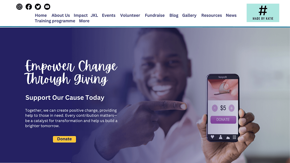
Does your charity's website navigation menu look like this:?

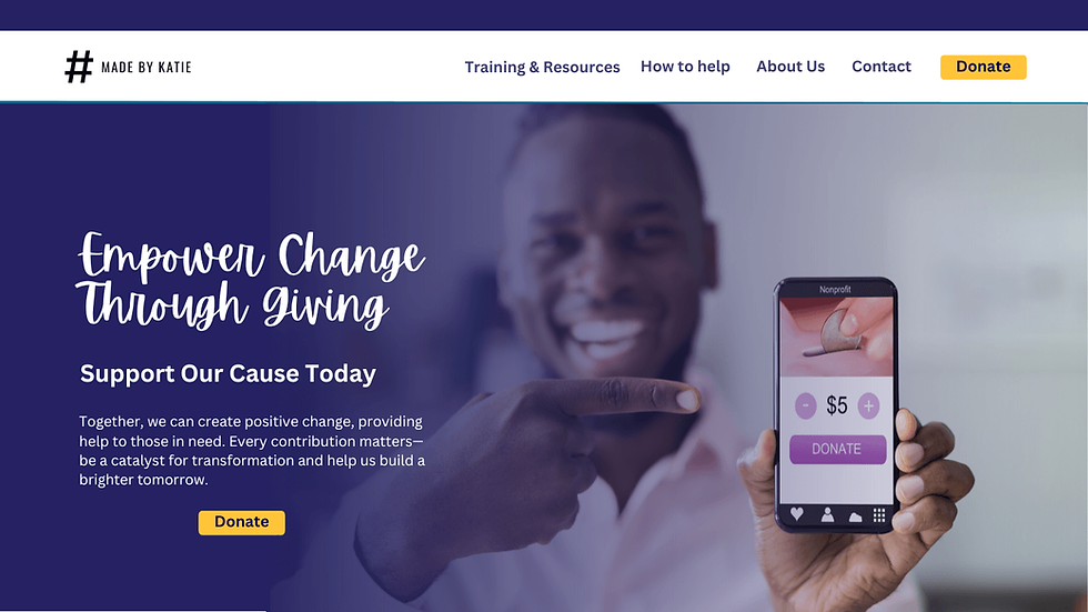
Website Navigation menus work best when they are short, simple and work in the way you expect them to.

So what should you include in your website's navigation menu in 2024? Here are some key elements:
Home page link:
This returns users to your landing page and is typically placed first. In 2024 you can free up some prime real estate on your menu by making your home button your logo. Many sites are embracing this pattern, which streamlines the experience. And because logos are often positioned at the top left, it's easy for users to locate and functions similarly to a "home" link. Just be sure your logo image is large enough to allow easy clicking on mobile. This logo/home link combo helps declutter your navigation while still providing a familiar way to reach the home page.
Logo Alignment:
Speaking of logos, properly positioning your brand image in the navigation bar is another important consideration. Follow convention by placing your logo on the left-hand side of the menu bar. This adheres to users' accustomed navigation patterns, allowing them to quickly locate it. Putting the logo on the left also enhances brand recognition. Users will view it each time they return to a page, reinforcing familiarity with your organisation.
In a perfect world, your charity will have both a stacked version and a horizontal version of your logo. The longer horizontal or landscape-style logo typically works best within the navigation bar. It fits nicely left-aligned and gives your brand maximum visibility. Just be sure the logo size is sufficient for easy clicking and home page navigation. Having versatile logo files with different layouts gives you flexibility to incorporate your brand in a polished, professional way.
Prioritise Menu Options:
When organising your navigation links, be strategic about placement to optimize user experience. Bookend your menu with the most crucial options by putting them both at the beginning and end. This allows users to immediately find important pages as their eyes scan the bar. It also positions vital links in the last spot users see when browsing the menu, recapturing attention before exiting.
For example, you may lead with an "Services" link followed by key sections like "Programs", "Get Involved" and "Donate". End with a prominent "Contact" or "Donate" link depending on your most desired action. This bookending technique ensures high-priority pages capture attention from start to finish.
Remember to keep search engine optimization (SEO) in mind when structuring your navigation. A short, clear, properly organized menu makes it easier for search engines to crawl, index and understand your site architecture. Avoid overly long or convoluted menus that may confuse algorithms. A clean navigation structure signals relevancy to search engines, ultimately enhancing your visibility and findability.
Limit Menu Options:
Less is definitely more when it comes to website menus. Streamline your menu to avoid overwhelming visitors with too many choices. Focus on essential sections and consolidate where possible to maintain simplicity and clarity. As a rule of thumb you should be offering between three and six options. A short navigation bar is easier and faster for people to read through. If they have to hunt through lots of options, they are more likely to leave your website or miss the key call to action like ‘donate’.

Create Categories and Drop-Downs:
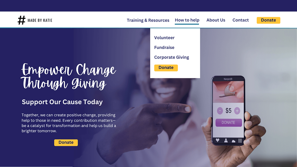
If you have a lot of content (which is great for your SEO) organise your menu into categories and subcategories, utilising drop-down menus if necessary. This hierarchical structure declutters the main menu while providing a logical flow for visitors to explore deeper into specific sections.
User-Friendly Language:
When titling your navigation links, use clear, straightforward language that will be instantly understandable to your audience. Avoid ambiguous or vague terms. Instead, call a spade a spade - say exactly what each page or section contains. Using concise, descriptive headings makes your menu easily scannable and intuitive to navigate.
Additionally, resist the temptation to use insider acronyms or jargon only an employee would recognise. Terms that seem obvious internally can perplex external visitors. Opt for wording that will resonate with the majority of people accessing your site. If certain programs or initiatives are known by acronyms, spell out the full name with the abbreviation in parentheses on first mention for clarity.
Your goal is to create a navigation system using simple, accurate language familiar to your users. This ease of comprehension ensures visitors can efficiently find what they need through self-explanatory menu options. Clear headings coupled with well-organised categories keep users on track while browsing.

Customised Call to Action (CTA) Button:
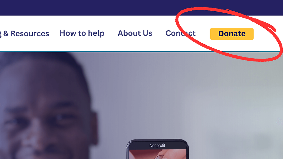
Enhance engagement by incorporating a customised CTA button. Tailor it to prompt specific actions aligned with your organisation's goals, such as ‘Donate Now,’ ‘Get Involved,’ or ‘Join Our Cause,’ compelling visitors to take meaningful steps. Make this stand out by making it a different colour and placing it on the far right of your menu.
Social Media Placement:
When it comes to social media icons, resist the urge to place them prominently in your top navigation menu (this is something I have to keep reminding myself). Leading with social links can inadvertently encourage users to exit your site sooner than ideal.
Instead, position social follow icons in your website's footer area. This keeps the focus on exploring your content while still providing access to your social profiles. The footer integrates sharing options in a more natural progression - after users have engaged with your pages, they can then follow or share if compelled.
Keeping social media links tucked away in the footer also contributes to a decluttered navigation bar. Your main menu real estate is prime visibility for your core content, so don't dilute it with external outlets. Concentrate on guiding visitors into your site experience first before directing them elsewhere.
Strategic Navigation Creates User-Friendly Websites
So there you have it - eight strategic principles to help charities and nonprofits declutter their navigation bars and craft user-friendly menu systems. By focusing on simplicity, organisation and comprehension, you can create a website experience that delights visitors and makes navigating your content intuitive.
An optimized navigation menu plays a pivotal role in engaging and retaining your audience, encouraging deeper exploration of your organisation's offerings. When visitors can easily find what they need, they'll stick around longer, perceive your brand more positively and become invested supporters of your cause.
Let's Partner to Improve Your Charity's Website Navigation
But executing a design overhaul can be daunting for resource-strapped charitable organisations. That's where working with an experienced web developer can help turn these tips into reality.
As a web design professional passionate about the not for profit sector, I'm available to partner with charities and transform their navigation systems. If you're ready to upgrade your website navigation, let's chat. I'd love to learn about your charity and goals to see how I can help craft a user-friendly experience that furthers your mission. Together, we can make navigating your digital presence smooth sailing for all users.
